Using this video, It will help me to find ways to help light the location in which we will want to film with my group, which predominantly in quite a dark shipping container. and will provide a more interesting set to pull in the audience rather than be boring.


Make sure to use film lights: without using specified film lights, normal lights that are around have the potential to strobe on camera and look really poor, and you won't be able to control the intensity of them. Good contrasting colours that are regularly used in films are orange and blue. also make sure that the lights are balanced with each other
.
.


Try to avoid overhead lighting as it can cause shadows to appear which may darken your scene and yourself as the actor in the scene, lucky our open won't feature any lighting overhead as of now but this could well change, but we could also have this problem if the lights are below for example it may light up the bottom but not the top.
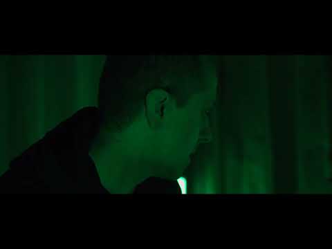
How to use Neon lights for filming
Now this video which i have used to help me fro my opening focuses on more the lights we will be using throughout this opening which are neon styled green lights as it's not your normal colour to use but lots off people like the aesthetics of neon lights in films. Personally for me like it is suggested in the video that i want the colours to sort of a character in the film and they have a huge role to play within.
I can use this to apply to ours by choosing 2 colours that work well with the film at the moment we really like the colour green as its quite unique, to contrast with this we may try to add a tint of orange to try and divide the shot up.


No comments:
Post a Comment